School project · School · Concept · academic · Supporting
Lidl Redesign — faster path to weekly deals
Information-architecture redesign concept helping seniors and students reach weekly deals faster — an academic e-commerce UX study.
- E-commerce
- IA
- Inclusive design
- Role
- UX / UI (academic project)
- Team
- Student team
- Timeline
- Academic redesign sprint
- Platform
- Responsive web
Brief
What a recruiter should know in 30 seconds
What I did
Contributed UX/IA thinking for a Lidl website redesign concept focused on weekly-deal discovery.
What changed
Proposed elevating weekly deals in primary navigation and homepage hierarchy.
How we knew
Academic concept — not a Lidl production launch; no public performance metrics.
Insight → decision
Evidence that changed the design
Insight
Weekly deals are often the destination, not a side promotion.
Decision
Elevate deals in IA for seniors and students seeking speed and clarity.
Visuals
Artifact
01
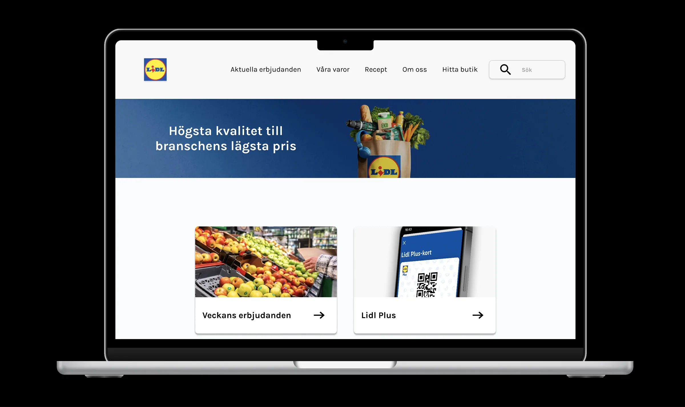
Homepage concept — elevating weekly deals in the primary journey
Academic IA concept — not a Lidl production launch.
- Weekly deals treated as a primary job
- Faster path for seniors and students
- Structure over decorative UI polish
Approach
Problem, role, and decisions
Problem
Weekly deals are a primary reason many users visit, yet the path to those offers could feel buried under generic e-commerce hierarchy — costly friction for time- and attention-constrained shoppers.
What I owned
Contributed to UX and information architecture for an updated Lidl website experience oriented around a faster path to weekly deals for seniors and students.
Key decisions
Elevate weekly deals in IA
Matches the dominant reason many users arrive
Accessibility
- Inclusive focus on seniors — clearer labels and reduced cognitive load in the proposed structure
- Contrast and reading order considered in proposed UI
Results
Outcome
Project type
Academic redesign — not a Lidl production launch
Outcome
IA concept elevating weekly deals for seniors and students
Reflection
- Lesson
- Inclusive design starts in structure, not in color choices.
- What I would improve
- Run comparative tree tests with seniors and students before visual design lock.