Greenely · 2025 · Shipped recommendations
Home Battery Control — Research that reshaped the MLP
Usability research for Greenely’s first home-battery controls — turning six sessions into roadmap changes for scheduling, state-of-charge, and time-remaining.
- UX Research
- Energy
- MLP
- Accessibility
- Role
- UX Researcher (Product Design contribution)
- Team
- Lee Georges (notes & design), Pierre Fosto (product management)
- Timeline
- Pre-MLP validation sprint
- Platform
- iOS / Android app
Brief
What a recruiter should know in 30 seconds
What I did
Planned and ran six usability sessions; synthesized and prioritized recommendations for Product and Design.
What changed
Scheduling, state-of-charge display, and time-remaining were pulled into the next sprint.
How we knew
Stakeholders estimated faster setup and fewer “when will it finish?” support questions — production metrics remain internal.
Insight → decision
Evidence that changed the design
Insight
Users didn’t know when charging would finish.
Decision
Prioritized time-remaining feedback as a clarity fix for the MLP.
Insight
People wanted overnight charging when prices are lowest.
Decision
Elevated delayed-start scheduling into near-term roadmap recommendations.
Insight
Battery health optimization was a trust requirement, not a nice-to-have.
Decision
Recommended making health-aware defaults part of the lovable first experience.
Decisions
Why we chose what we chose
01
Prioritize time remaining
Most consistent pain point across sessions; directly answers “is this working?”
02
Push delayed start into near-term roadmap
Matched explicit user jobs and Greenely’s value prop around cost-aware energy use
03
Require dual-unit SoC
Percent is familiar; kWh connects to real household energy intuition
04
Recommend one-time setup
Repeated configuration created unnecessary cognitive tax and error risk
Depth of education vs. operational clarity
Ship clarity and control first; education second
Users asked for feedback and scheduling more than textbooks
Broad feature set vs. MLP focus
A short prioritized list for the next sprint
Research only creates value if engineering can absorb it
Visuals
The work, annotated
01
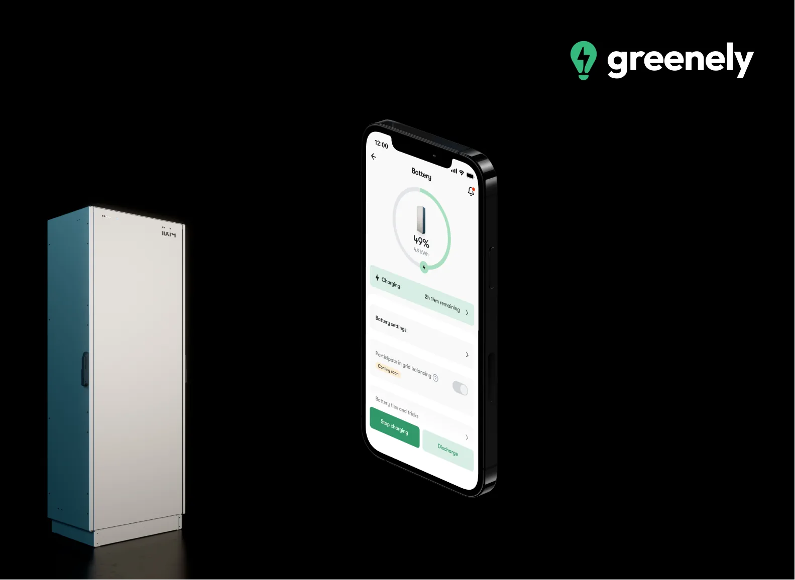
Battery state — making status legible without requiring energy expertise
Research artifact: status language tested with non-experts before MLP lock.
- Plain-language status over energy jargon
- Immediate “what is it doing?” answer on first glance
- Framed for mixed technical literacy, not enthusiasts only
02
Delayed start — aligning charging with low spot-price windows
Elevated from research: overnight low-price charging was a core job, not a power-user add-on.
- Scheduling tied to spot-price reality
- One clear control for “start later”
- Roadmap priority pulled into the next sprint
03
State of charge in both kWh and % for mixed literacy
Dual units reduce translation cost between “household” and “technical” mental models.
- kWh and % shown together
- Supports both bill-minded and capacity-minded users
- Avoids forcing a single unit convention
04
Time remaining — the insight users asked for most directly
Highest-severity gap in sessions: people did not know when charging would finish.
- Clock-based feedback, not only power metrics
- Reduces “is it working?” anxiety during automation
- Direct response to the most frequent verbatim
Accessibility
Inclusive decisions
- Scripts and moderation checked whether labels and translations were understandable under real cognitive load — not only visually present
- Recommendations favored explicit text status (time remaining, state labels) over icon-only cues
- Dual units reduce cognitive accessibility barriers for users who do not think in percentages
- Future audit opportunity: keyboard/screen-reader paths for scheduling controls on native platforms — [Add WCAG audit artifacts here]
Results
What changed
Findings were socialized with Product and Design; several recommendations were accepted into the next sprint — particularly scheduling, state-of-charge display, and time-remaining indicators.
Roadmap impact
Multiple research recommendations pulled into the next sprint
Estimated setup-time effect
Stakeholders estimated ~25% reduction in setup time
Support signal
Anticipated fewer tickets around “when will it finish charging?”
Production metrics
[Add measurable outcome here — activation, task success, support volume]
Business impact
Faster, clearer setup reduces time-to-value for battery owners and protects brand trust in a category where mistakes feel expensive. Research de-risked MLP scope before broader release.
User impact
Users gain the ability to see progress in time, schedule charging for low-price hours, and understand charge level in familiar units — turning an opaque battery into a controllable home system.
Reflection
What I would tell a hiring manager honestly
- Biggest surprise
- Temporal feedback and overnight scheduling outranked “explain batteries better” as the path to trust.
- Biggest mistake
- I could have quantified severity with a tighter task-success rubric earlier to make prioritization even sharper for PMs.
- Lesson
- In emerging energy UX, operational clarity is the education.
- What I would improve today
- I would add a lightweight diary study after release to validate whether delayed start changed real charging behavior overnight — not only usability scores.
Deep dive
Context, research, and collaboration
Full process detail for readers who want the long arc. Scan sections above cover the hiring signal.
Context
Where this work lived
Greenely is a digital electricity company helping people understand and reduce energy use. Ahead of launching home-battery control in the app, the team needed confidence that the Minimum Lovable Product (MLP) would feel intuitive, useful, and trustworthy to non-experts — not only to energy enthusiasts.
Problem
The tension we had to resolve
Battery control introduces unfamiliar concepts (charge/discharge behavior, spot prices, battery health) into a consumer product. Shipping without validating mental models risked confusing setup, support load, and eroded trust in an already high-stakes domain: people’s homes and electricity bills.
Goals & constraints
What success required
Business
- Validate the MLP before release to reduce rework and support cost
- Increase confidence that users can configure battery controls without hand-holding
- Prioritize the smallest set of features that create a lovable first experience
Users
- Understand what the battery is doing right now
- Control charging in ways that match real life (including overnight low-price windows)
- Trust that optimization will not harm battery health
Constraints
- Lean research window before MLP release
- Mixed technical literacy across prospective users
- Translation and labeling clarity mattered in real Swedish/English product context
- Engineering capacity limited how many recommendations could land in the next sprint
Role
What I owned
I owned the research plan and test script, recruited and screened six representative participants, moderated interviews and usability sessions, synthesized findings through affinity mapping, and presented prioritized recommendations to Product and Design.
Research
What we asked, learned, and unlearned
Guiding questions
- Can users understand and configure battery controls without guidance?
- Does the interface feel intuitive to non-technical users?
- Are labels and translations clear in a real user context?
Methods
- Six semi-structured interviews paired with moderated usability tests
- Behavioral observation + verbatim quotes
- Affinity mapping to cluster insights into actionable themes
- Prioritized recommendation readout with Product and Design
What surprised us
Users were less blocked by “how batteries work” than by missing temporal feedback — especially not knowing when charging would finish — and by wanting overnight scheduling tied to spot prices. Battery health optimization was an explicit trust requirement, not a nice-to-have.
Assumptions that were wrong
We initially over-indexed on educating users about battery mechanics. Research showed the higher-leverage gaps were operational: time remaining, delayed start, dual units for state of charge, and a one-time setup model instead of repeated configuration each session.
Quotes
Voice of the user
“I don’t know when the battery will finish charging.”
Missing temporal feedback created anxiety and undermined trust in automation.
“I want to start charging in the middle of the night when prices are lowest.”
Scheduling was a core job-to-be-done, not an advanced power-user feature.
“I would like Greenely to provide the best optimization for battery health.”
Users expected the product to protect long-term asset health — a retention and trust lever.
Strategy
Principles, bets, and how the work moved
Principles
- Show time as clearly as power — users decide with clocks, not only kilowatts
- Make money-saving automation legible and schedulable
- Treat battery health as a first-class trust signal
- Prefer one durable setup over repeated configuration tax
Opportunity areas
- Display time remaining for charging/discharging
- Add delayed start scheduling for low spot-price windows
- Surface optimization options that protect battery health
- Show state of charge in both kWh and %
- Move to one-time configuration instead of per-session setup
Product strategy
Prioritize comprehension and control for the first lovable loop: know status → schedule wisely → trust health. Defer deeper education content until the operational gaps are closed — otherwise education becomes a band-aid for unclear feedback.
Hypotheses
- If we show time remaining, users will complete setup with less hesitation and fewer support questions.
- If delayed start is available, users will adopt overnight charging aligned with spot prices.
- If SoC is shown in kWh and %, mixed-literacy users will self-serve without unit conversion friction.
Exploration
Sessions mixed think-aloud configuration tasks with follow-up probes on language, trust, and expected automation. Synthesis clustered friction into temporal feedback, scheduling, health, and setup repetition — then ranked by frequency × severity × feasibility for the next sprint.
Recommendations were sequenced for product intake: time remaining and SoC dual units as clarity fixes; delayed start as the high-value capability bet; health optimization as a trust narrative tied to defaults.
Collaboration
How the team shipped
Collaboration
Worked tightly with Lee Georges on note-taking and design interpretation, and with Pierre Fosto on product prioritization — translating affinity themes into sprint-ready recommendations rather than a slide deck of observations.
Engineering
Recommendations were framed as product requirements with clear user evidence, so engineering could estimate scheduling and SoC presentation work without re-deriving the problem. Exact ticket IDs and estimates remain internal — [Add engineering constraint notes here].