Greenely · 2025 · Shipped to production
History Graph — clarifying bi-directional battery behavior
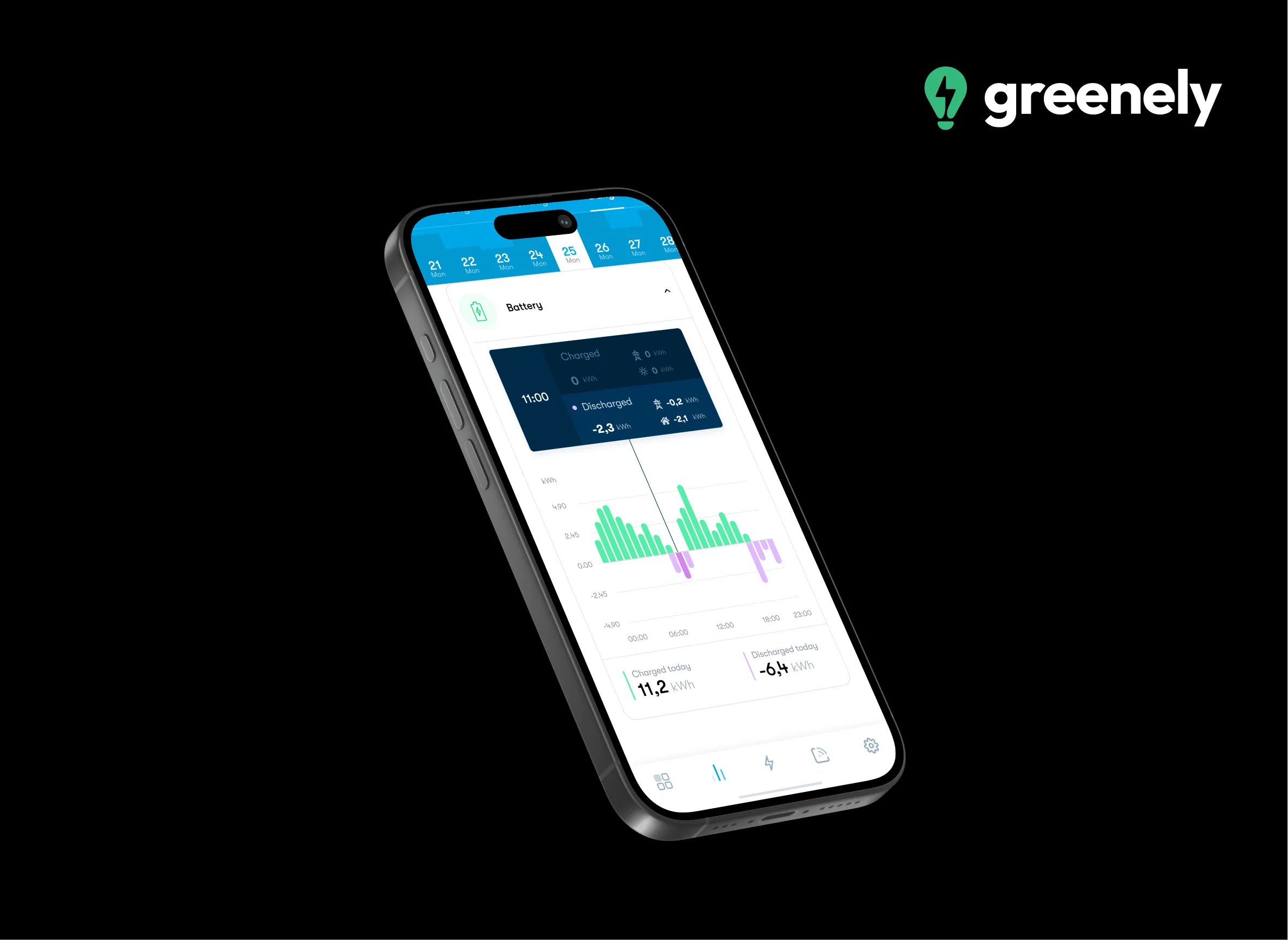
50+ iterations to visualize charging and discharging over time — so non-experts can see where energy came from, where it went, and what the battery did.
- Product Design
- Data Viz
- Interaction
- Energy
- Role
- Product Designer — UX/UI
- Team
- Product stakeholders + cross-functional reviewers
- Timeline
- Multi-iteration design cycle (~50 versions)
- Platform
- Mobile app module
Brief
What a recruiter should know in 30 seconds
What I did
Explored and iterated the battery history graph (~50 versions); aligned visual language with stakeholders.
What changed
Text labels and stronger selected-state cues replaced ambiguous iconography; design accepted into the app.
How we knew
Internal non-expert reviews reported quick understanding with minimal instruction — quantified product metrics not shared publicly.
Insight → decision
Evidence that changed the design
Insight
Icons for charging/discharging added noise more than clarity.
Decision
Replaced icons with explicit Charging / Discharging labels plus a selected-state indicator.
Insight
Users asked “which state am I looking at?” as often as they asked about the data.
Decision
Strengthened selected-stack emphasis so the active series is unmistakable.
Insight
Inflow/outflow was easy to imply and hard to prove with color alone.
Decision
Made energy source and destination structure explicit in the chart encoding.
Decisions
Why we chose what we chose
01
Text labels over charging/discharging icons
Reduced ambiguity under density; icons competed with the data
02
Selected-state darkening + indicator
Made the active series scannable without redrawing the entire encoding
03
Explicit inflow/outflow structure
Answered the user question that pure polarity stacks left implicit
Information richness vs. calm readability
Keep flow detail but escalate hierarchy aggressively
Removing data would hide battery value; poor hierarchy would hide it anyway
Novel metaphor vs. familiar stacked bars
Stay with refined stacks
Familiar form reduced learning cost; craft fixed the failure modes
Visuals
The work, annotated
01
Exploration — encoding bi-directional battery behavior over time
Early passes proved polarity and density before visual language polish.
- Positive/negative stacks across a 24-hour window
- Bi-directional energy is easy to misread without hierarchy
- Exploration prioritized comprehension over decoration
02
Refinement — hierarchy and density under mobile constraints
Mobile viewport forced ruthless priority: first read must survive small screens.
- Spacing and contrast micro-iterations
- Density allowed only after hierarchy held
- Aligned with existing solar/consumption chart language
03
Selected state — making the active series unmistakable
Icons lost to plain labels; selected-state cues carried mode clarity.
- Charging / Discharging as text, not icons
- Indicator + darkening for the active series
- Answers “which state am I looking at?” first
04
Flow detail — where energy came from and where it went
Color alone was not enough — structure had to prove inflow vs outflow.
- Explicit source and destination encoding
- Secondary detail without breaking the first read
- Supports the “where did the energy go?” question
05
Toward production — visual language aligned with Greenely’s data UI
Stakeholder-aligned lock: labels, states, and color roles ready for engineering.
- Production-ready selected/unselected states
- Copy and color roles specified for handoff
- Accepted into Greenely’s app after internal non-expert reviews
Accessibility
Inclusive decisions
- Color was never the only signal — labels and indicator states carry meaning
- Contrast tuned so selected vs. unselected stacks remain distinguishable
- Avoided icon-only mode identification
- Cognitive a11y: reduced competing metaphors so the first read stays stable
- Opportunity: pattern descriptions / textual summary of daily battery behavior for screen-reader users — [Add SR transcript / audit notes here]
Results
What changed
Internal usability feedback indicated non-experts could understand battery behavior with minimal instruction. The design was accepted into Greenely’s app.
Production
Revised graph accepted into Greenely’s app
Comprehension
Internal non-expert reviews reported quick understanding with minimal instruction
Iteration rigor
50+ design versions before lock
Quantified impact
[Add measurable outcome here — comprehension task success, engagement with history module]
Business impact
Clearer battery history helps users perceive value from hardware + software — supporting retention and informed use of energy features.
User impact
People can inspect charging and discharging over time without translating an engineer’s chart into household meaning.
Reflection
What I would tell a hiring manager honestly
- Biggest surprise
- Removing icons improved understanding — more metaphor was not more clarity.
- Biggest mistake
- I spent too long exploring decorative cues before stress-testing selected-state hierarchy with non-experts.
- Lesson
- In data UX, hierarchy is a product decision, not a visual afterthought.
- What I would improve today
- I would pair the graph with a one-sentence daily summary (“Charged from solar 11:00–14:00, discharged to home 18:00–21:00”) for cognitive accessibility and scannability.
Deep dive
Context, research, and collaboration
Full process detail for readers who want the long arc. Scan sections above cover the hiring signal.
Context
Where this work lived
Greenely already communicated solar output and household consumption reasonably well. Home batteries introduced a harder visualization problem: energy moves in two directions, across sources and destinations, across time.
Problem
The tension we had to resolve
Users needed to understand battery behavior historically — when it charged, when it discharged, where energy came from, and where it went — without drowning in density or misreading polarity.
Goals & constraints
What success required
Business
- Increase comprehension of battery value in the app
- Support informed use of battery features after install
- Ship a visualization quality bar consistent with Greenely’s data products
Users
- Answer “what did my battery do yesterday?” in seconds
- Distinguish charging from discharging without decoding a legend every time
- See energy flows (in vs out) with confidence
Constraints
- Mobile viewport limits information density
- Bi-directional data is easy to misread if polarity is ambiguous
- Must stay visually coherent with existing solar/consumption charts
- Stakeholders needed a production-ready visual language, not a concept study
Role
What I owned
I sketched graph concepts and metaphors for bi-directional data, iterated through 50+ design versions for clarity and hierarchy, tested prototypes internally with teammates of varying battery knowledge, and aligned final color, typography, and labels with product stakeholders.
Research
What we asked, learned, and unlearned
Guiding questions
- Can non-experts tell charging from discharging at a glance?
- Do stacked positive/negative encodings reduce or increase error?
- Which cues (icons, labels, color, selection states) create durable understanding?
Methods
- Internal usability reviews with cross-functional, non-expert participants
- Comparative critique across iterative prototypes
- Visual hierarchy passes focused on selected-state clarity
What surprised us
Icons for charging/discharging added noise more than clarity. Explicit textual labels plus a small selected-state indicator outperformed iconography for this data density.
Assumptions that were wrong
Early drafts assumed users would decode stacked polarity with minimal labeling. They needed stronger selected-state emphasis and plain-language status more than additional symbolic metaphor.
Quotes
Voice of the user
“Which state am I looking at right now?”
Selection and mode clarity was as important as the chart geometry itself.
“Where did the energy go?”
Inflow/outflow needed explicit visual structure, not implied by color alone.
“Don’t make me interpret icons under time pressure.”
Text labels scaled better than icon metaphors in a dense module.
Strategy
Principles, bets, and how the work moved
Principles
- Polarity must be unmistakable
- Selected state should be louder than surrounding data
- Prefer words over icons when stakes are comprehension
- Density is allowed only after hierarchy is solved
Opportunity areas
- Replace ambiguous iconography with Charging / Discharging labels
- Strengthen selected-stack emphasis
- Clarify energy source and destination encoding
- Tune 24-hour stack readability for mobile
Product strategy
Treat the graph as a comprehension product, not a decoration. Optimize for the primary question — what happened over time — then layer secondary flow detail without breaking the first read.
Hypotheses
- If labels replace icons, non-experts will identify mode faster.
- If selected stacks darken slightly, users will track the active series with fewer errors.
- If inflow/outflow is visually explicit, “where did energy go?” becomes answerable without support.
Exploration
Explored positive/negative stacks across a 24-hour window, alternative metaphors, title treatments, and cue systems. Many iterations were micro-adjustments to spacing, contrast, and label placement — the craft that decides whether a chart is trusted.
Roughly fifty versions refined hierarchy: mode labels, indicator light for selected state, darker active stacks, and clearer inflow/outflow depiction until internal non-experts could orient quickly.
Collaboration
How the team shipped
Collaboration
Aligned visual language with product stakeholders and pressure-tested comprehension with teammates who were not battery experts — a deliberate proxy while broader research was sequenced elsewhere on the battery initiative.
Engineering
Final specs emphasized states (selected/unselected), label copy, and color roles so engineering could implement consistently with existing chart infrastructure. Exact performance budgets and charting library constraints — [Add engineering notes here].